
Product Reviews Page Redesign
The Product Reviews Page redesign reimagines how members explore and evaluate products across America’s Test Kitchen. It emphasizes credibility, comparison, and exploration to support confident decision-making.
Opportunity
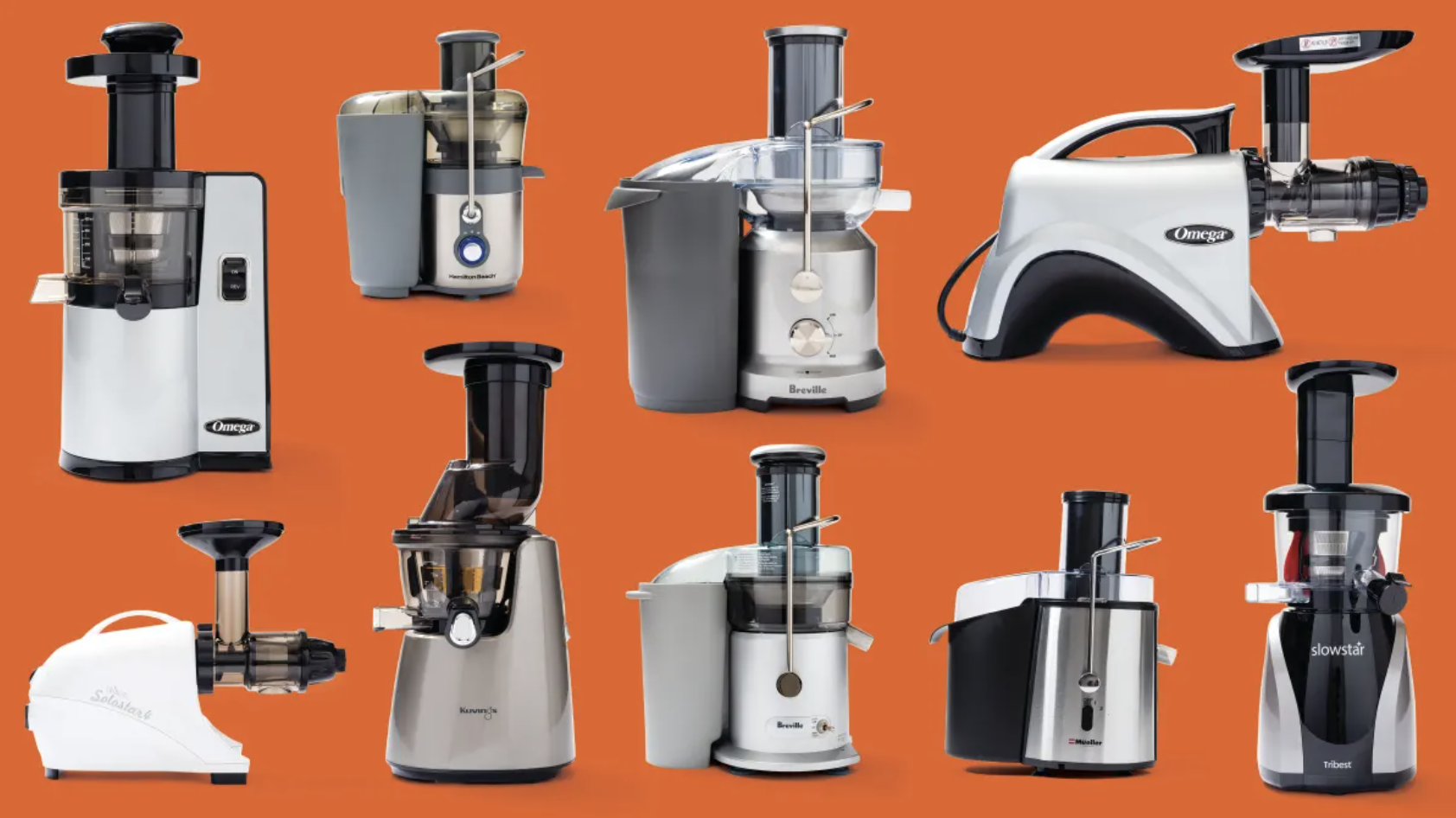
Many of ATK’s users start their research for gadget reviews, care tips and kitchen gift brainstorming on the ATK Reviews page. However, the Reviews page consistent of an endless scroll of reviews that could only be sorted/filtered by a short list of categories.
The UX and Reviews teams worked together to brainstorm ways to excite members will encouraging them to dive deeper in seeking information about their favorite kitchen equipment. By the completion of this project, we launched a redesign completed with demo videos, GIFs and sections of themed content for a scannable and fun browsing experience.
Solution
The redesigned page balances editorial storytelling with structured comparison, allowing users to move fluidly between summary and detail depending on their needs.
Feature 1
Surface our entire catalog of reviews to members
At the beginning of the project, the website did not show any categories for members to explore. In order to have the ultimate hub for all our Reviews content, we needed to create easy ways for our members get acquainted with the diverse categories of content we offer. So we added “bubble categories” that made it easy for users to scan all the equipment we’ve reviewed so far.
Feature 2
Establish a layout that champions routine refresh of content
We recognized that we needed to incorporate different sections of the page that would need to be refreshed every 2 months with new content. Outside of content updates, we were excited to include snippets of our YouTube videos covering kitchen gadget comparisons and tips to encourage members to dive deeper into exploration.
So we created a layout where highlighted content lived at the top of the page, added a video player, and a way for the content/editorial teams to customize sections across the page:
Feature 3
Reduce clicks to destinations members want to land on
Our vision for our “reviews hub” was grand and made us realize that we should aim to reduce any obstacles that make it difficult for members to reach the content they’d like to consume.
We saw an opportunity to achieve that by adding direct links to Review articles, product comparisons and Amazon product pages for our top-choice gadgets:
Outcomes
The app concept was well received by both clinicians and patients, who confirmed that the experience felt appropriate, supportive, and aligned with early stages of treatment. The designs were later used by clinicians as part of funding efforts to support further development, helping translate a clinical need into a tangible, testable product direction.
Check out the ATK Reviews page that’s live on AmericasTestKitchen.com!

The greatest value of a picture is when it forces us to notice what we never expected to see.
John Tukey | Statistician
CREDITS
Office: America’s Test Kitchen
TEAM
Lead: Tasmia Noor
Graphic Designer: Olivia Sheldon ATK Reviews Decision Maker: Kate Shannon